Roll20 Redesign
The redesign of the Virtual Tabletop platform Roll20 into a more user-friendly and enjoyable experience.
Overview
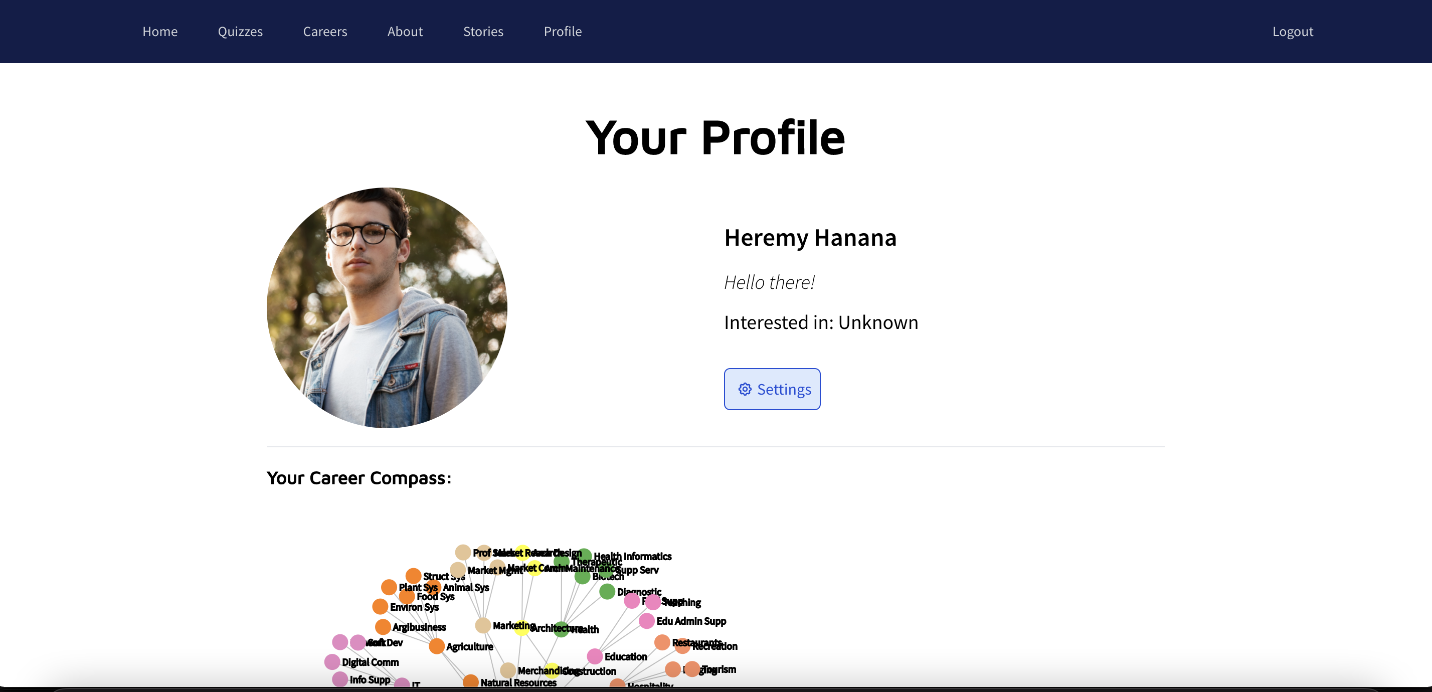
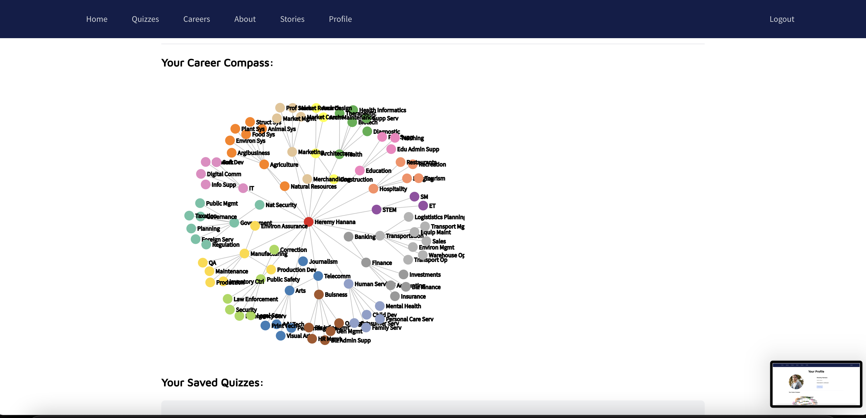
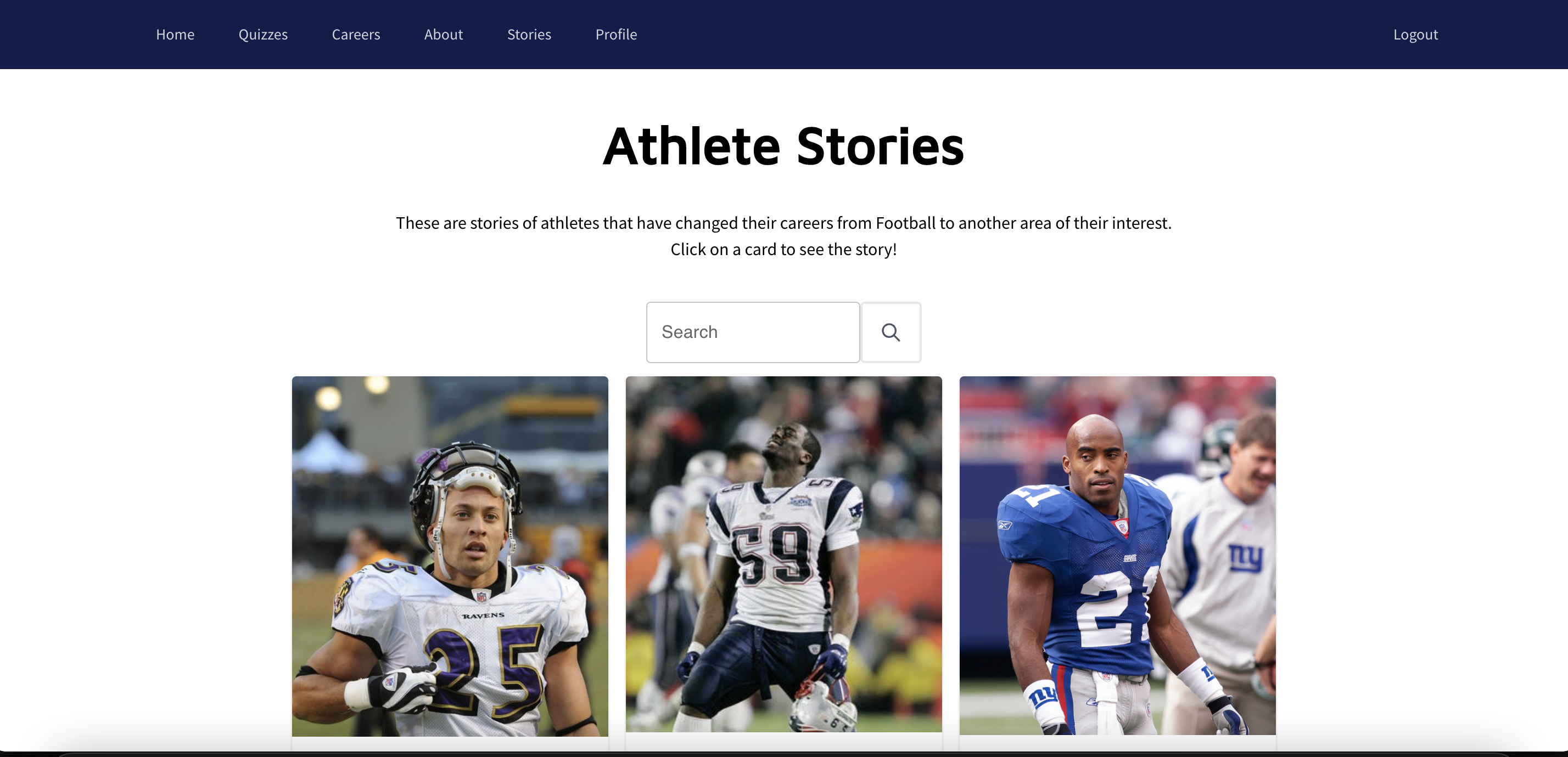
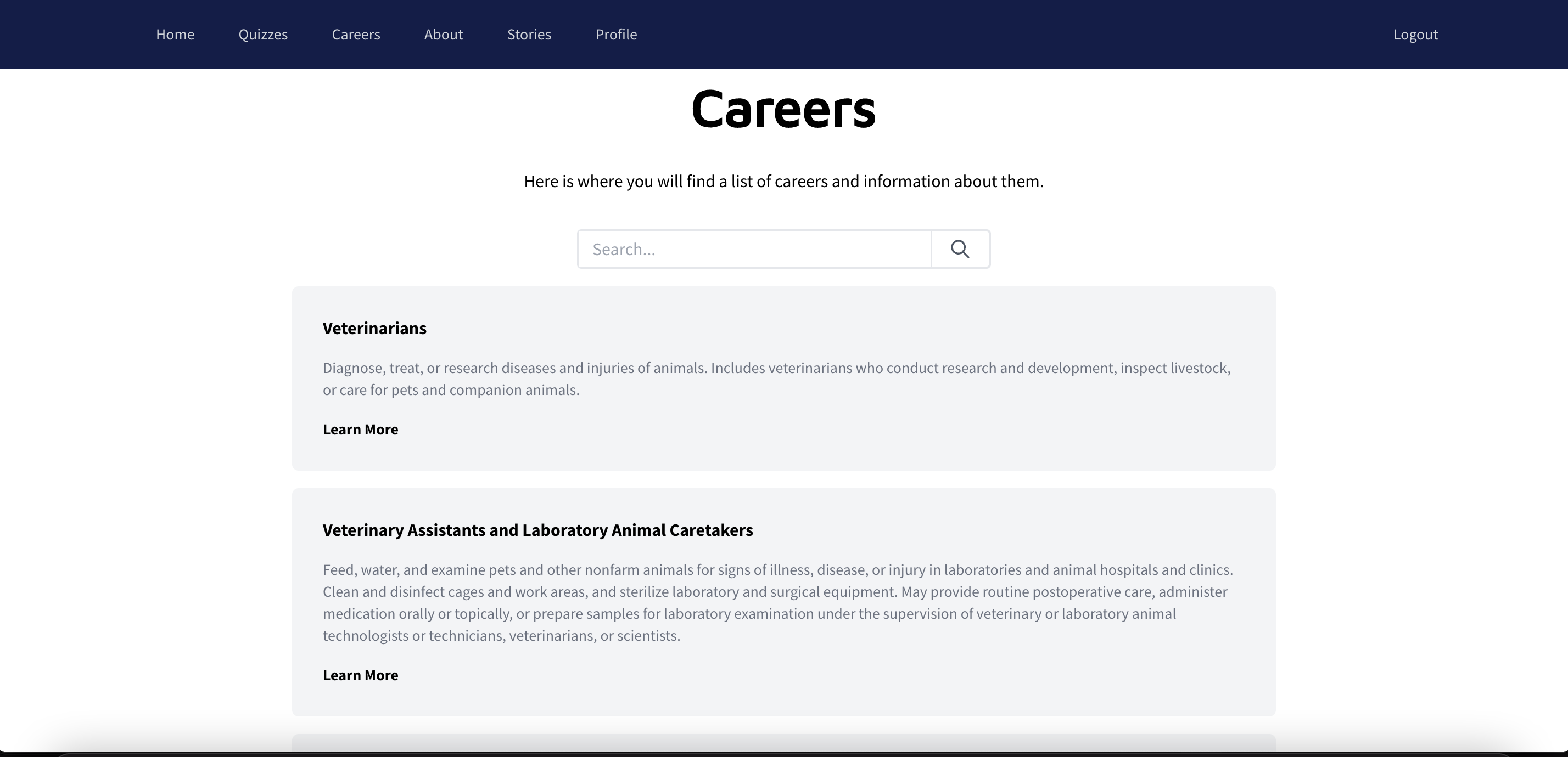
This project consisted in a career website for student athletes. The goal is to help athletes expand their career choices and have an interactive and useful site to help with their career decisions and motivate them based on their quiz results.
role
Languages/framework used
Tailwind CSS, MUI
scope
Overview
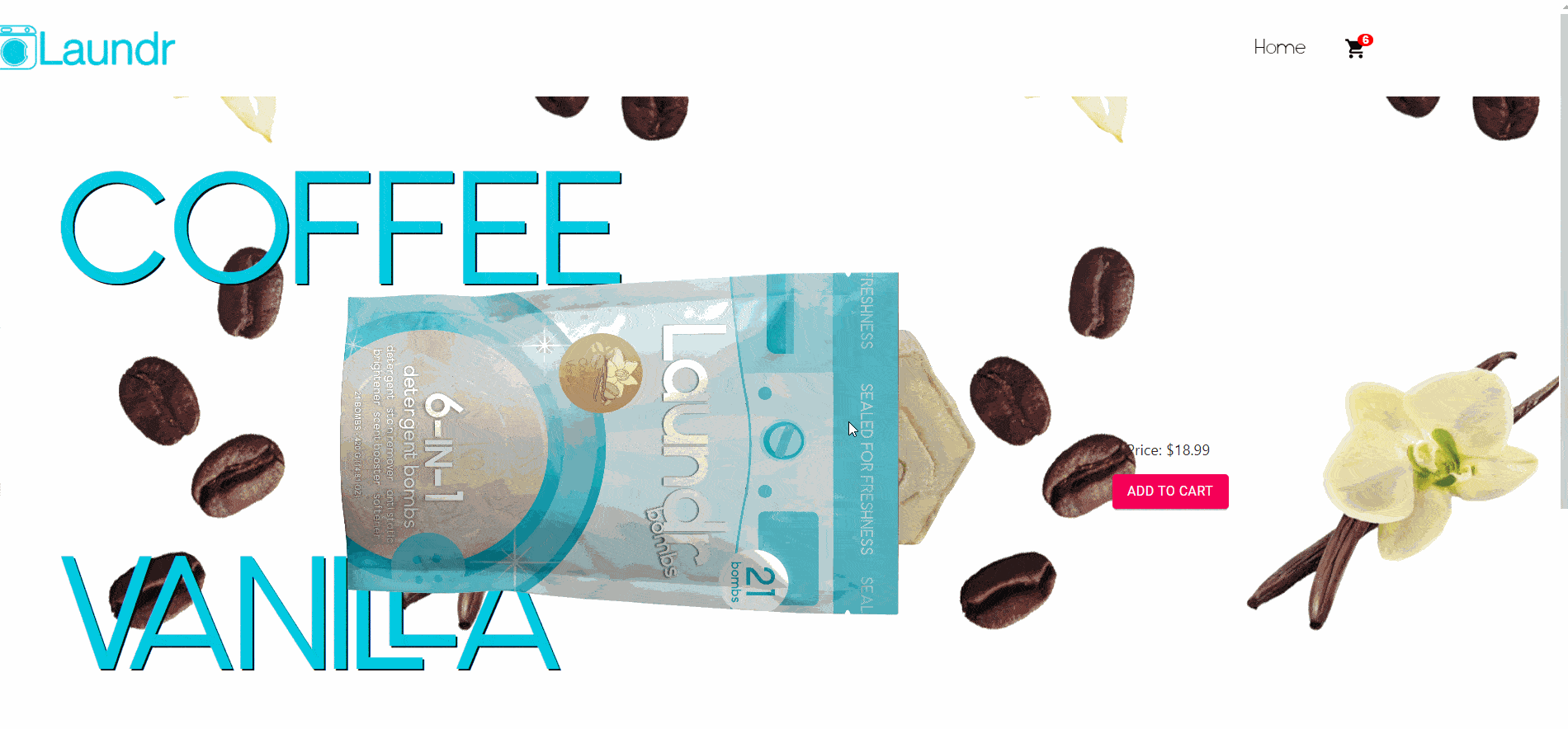
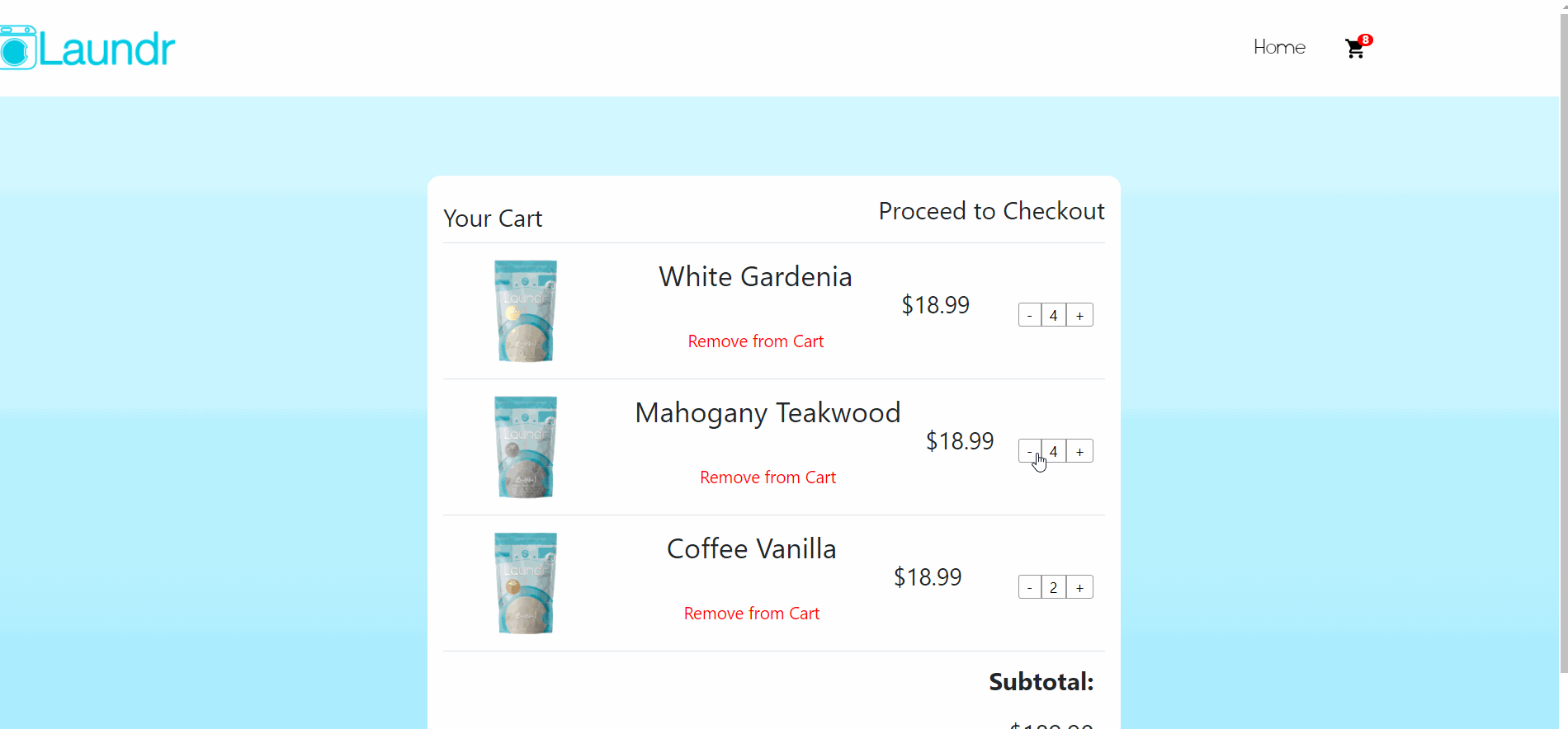
For this project, my team and I developed an e-commerce site for Laundr, a Gainesville-based company that offers on-demand laundry services and sells its own laundry bombs. The site was built mainly using React, it showcases their laundry products and is integrated with Stripe API
role
Languages/framework used
scope
Overview
This project was part of a semester-long class on UX Design. My team and I got to work on this real client project with Little Nail Lady Beauty or LNL Beauty. She is the owner of two nail salons and wanted a rebrand of her page and a redesign of the current booking process.
role
Tools used
scope
Overview
This project was part of a semester-long course on Human-Computer Interaction, where we were supposed to take a piece of software of our choice and redesign it based on user research and also develop a functional prototype with code. My team and I chose the web application Roll20 a virtual tabletop platform (VTT) used to play role-playing games (RPGs) with groups of people.
role
Tools used
scope
Proposal & Significance
What is it?
Roll20 is a browser-based virtual tabletop that gives users tools for creating, hosting, and partaking in virtual games.
Our Goals
Our team aims to ultimately maintain the accessibility of the Roll20 software while improving the interface so as to make the VTT more easily navigable and more intuitive to new and old users alike.
Importance
Roll20 is a free and highly accessible platform, which means that any advancements would benefit a large, diverse, and ever-growing community. Redesigning the interface would foster more seamless gameplay by allowing the interactions of and the connections in the game to take center stage.
Research
Our target users were people who use the Roll20 platform or are interested in tabletop role-playing games (TTRPGs). In order to get our target user data, we decided to create a survey that was easily accessible to them. The survey was posted to public subreddits that were likely to contain Roll20 users, such as the following:
r/DnD:
r/dndnext:
r/Roll20:
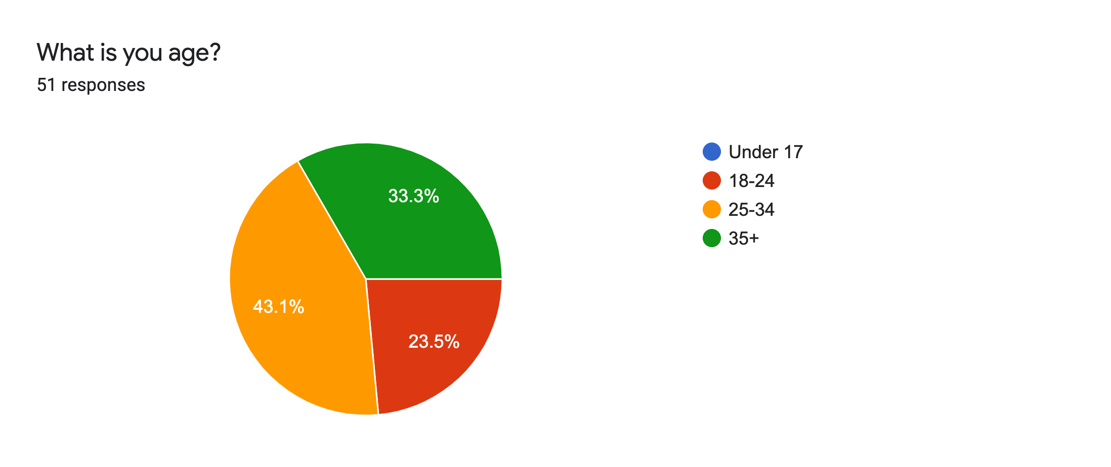
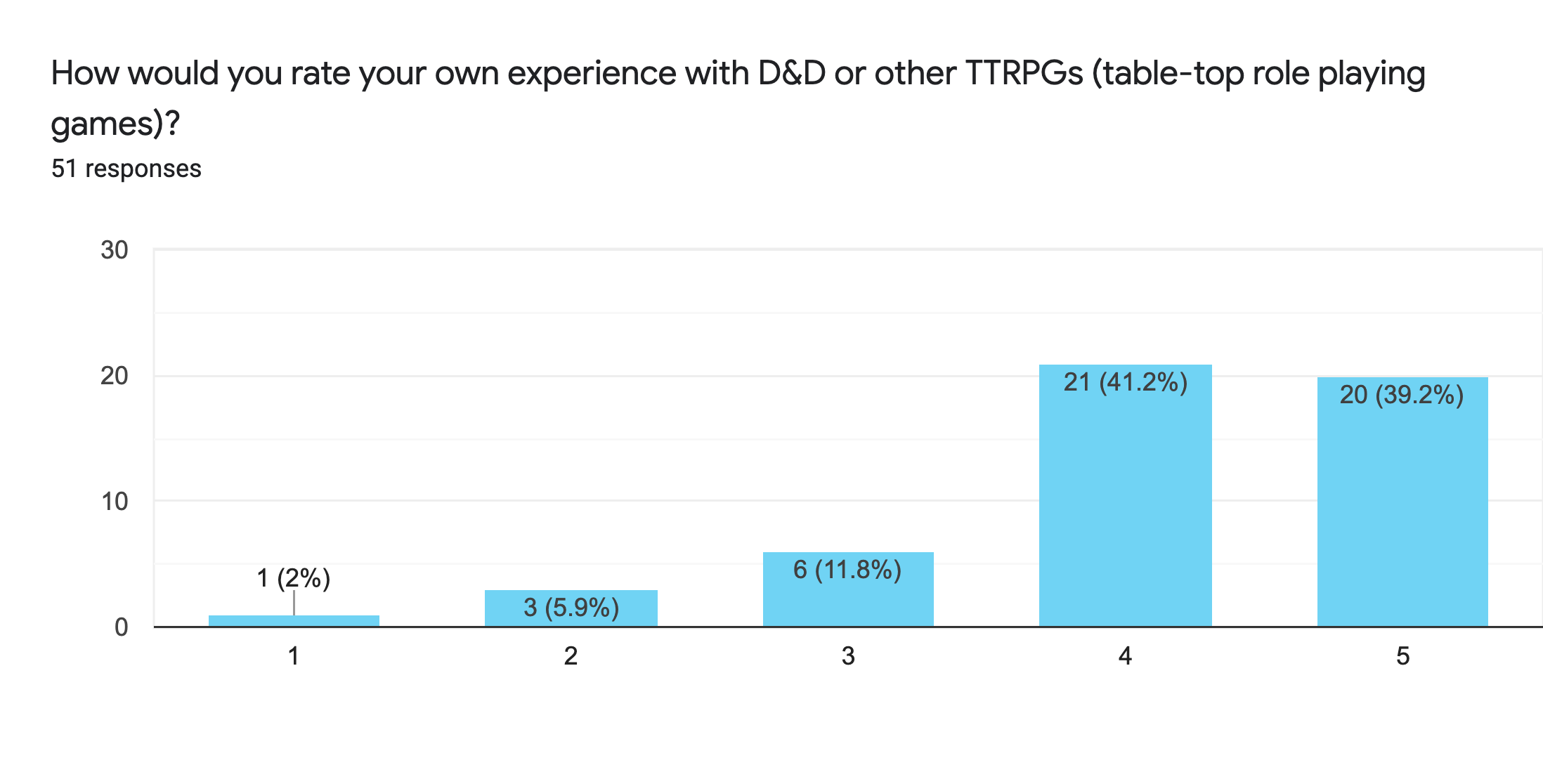
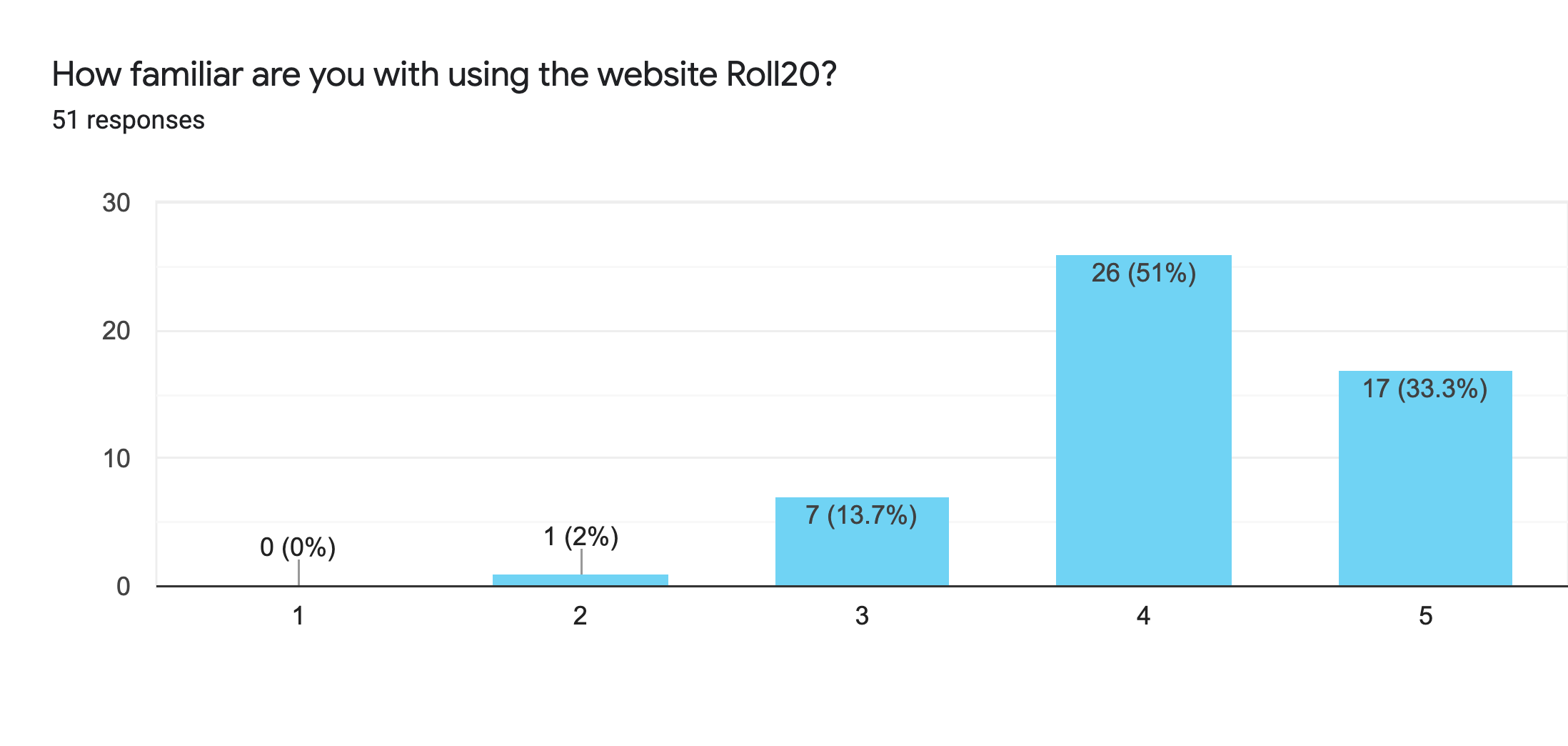
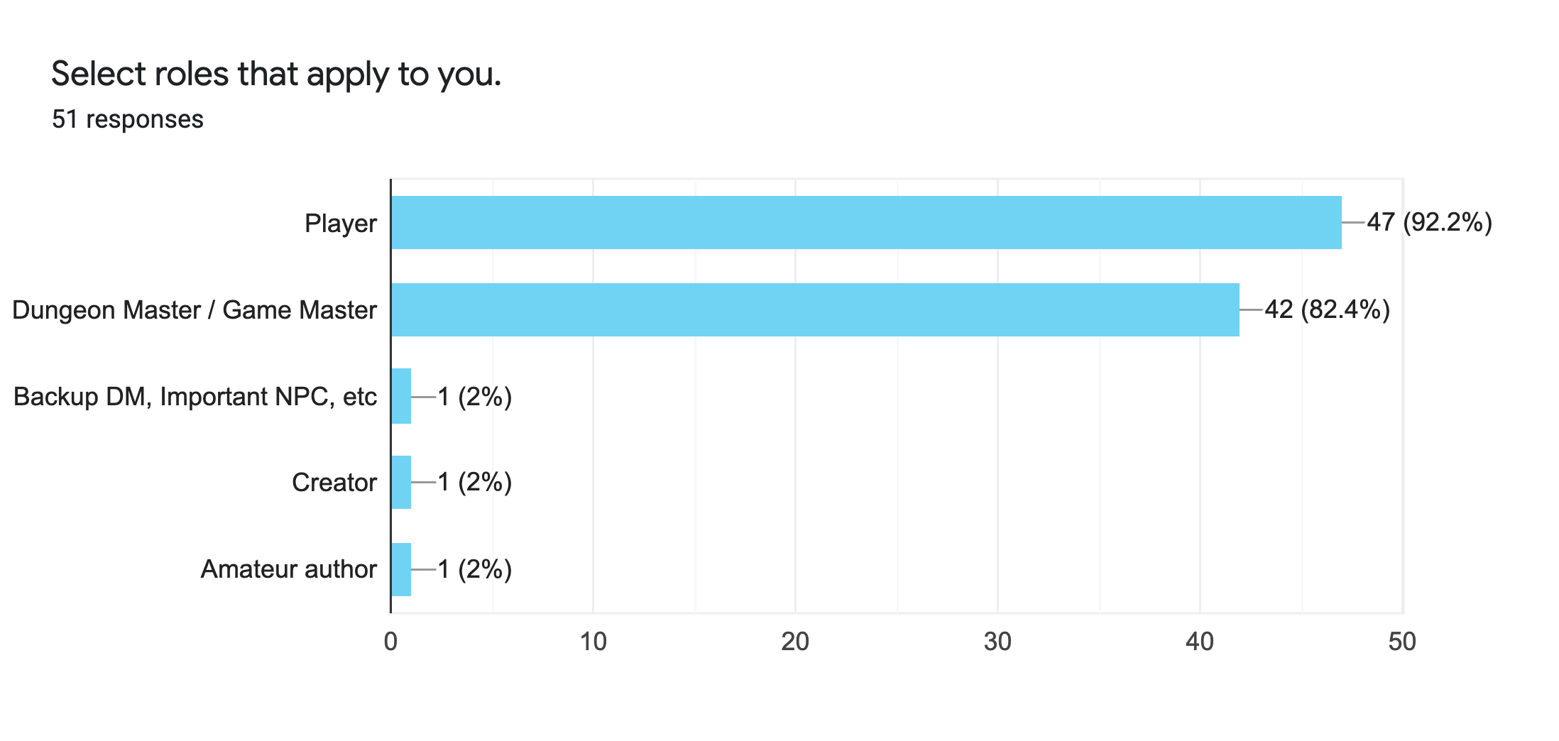
In total, 51 people completed the survey.
Individuals were asked:
- About their experience level with TTRPGs.
- About their familiarity with Roll20.
- To rate their experience when using certain features.
- To elaborate on the reasoning behind their ratings.
Insights
Reading the answers, it seemed like the people who completed the survey were mostly experienced players and had a lot to say about their Roll20 experiences. After analyzing the data, we concluded that the most important thing for the scope of this project was to eliminate unused features, and refine used ones (improving and simplifying the UX and UI of the platform).
Survey responses:
.png) See full survey
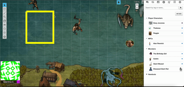
See full surveyCurrent Interface
The interface has two different views depending on the status of the user, GAME MASTER (GM) or PLAYER.
GM VIEW:
- Allows users to create simple maps by layering art assets and images on top of each other, using a drag-and-drop interface.
- Provides three layers to place assets: a background layer, a token layer, and a GM information overlay.
- Settings tab suffers from a similar issue.
Problems:
- Uploaded images are placed inside an unorganized art library, with no options to tag or label images.
- There is little to no indication on what layer the user is currently on besides a vague icon change in a side toolbar. Items on the map toolbar are unlabeled, making it difficult for a new user to figure out a menu item’s function without consulting a user guide or using trial-and-error.
- The user is given a lot of options without a lot of explanation of what those options will do.
With most tabletop role-playing games, a player will find themselves mainly interacting with their character sheet.
player VIEW:
- Character sheets are placed in a “Journal” tab, alongside other handouts the GM has provided (additional maps, art, items, etc.).
- Double clicking on the name of the modal will minimize it.
- Whenever a player rolls a stat, the results of that roll are sent into the chat tab.
Problems:
- In order to access their character’s stats (a frequent interaction), the user has to open up the sheet in a separate modal that takes up most of the screen. This makes it difficult to view the map and the character sheet simultaneously.
- There are no signifiers informing users that this is an available interaction.
- Rolling dice occurs frequently, meaning that normal chat messages tend to quickly get buried underneath the influx of dice results.
Design
Based on our survey, the main drawbacks of Roll20 are its:
- Laggy performance.
- Clunky UI.
- Unnecessary features that take up space.
- Overall poor UX design.
With these drawbacks in mind, we strive to create a minimalistic VTT client that cuts down on the clutter and only has the best features for the VTT experience. Our initial design focused on:
- Improving some aspects about the existing platform Roll20, mainly to make it less clunky and cluttered.
- Improving specific features like the layers handling, the character sheet, and the chat.
- Make the UI more modern.
- Make it more organized and clear.
- Add a darker theme.
The main features we changed are the following:
character sheet
In Roll20 the character sheet can be opened by clicking on the journal and then looking for the specific character’s name to read and interact with its character sheet and other information. It appears as a pop-up when clicking on the desired character which is a bit inconvenient since it is one of the most necessary features that the players interact with. The pop-up blocks the view of the map and makes things cluttered when trying to perform some actions and look at what is going on on the map simultaneously. We decided to add it directly in a tab on the sidebar so it is more accessible and it doesn’t block any view.
layers
Layers in Roll20 are handled from the map toolbar. The indication of which layer the user is in can be seen from the which icon is shown in the map toolbar. This was confusing for the users, especially new ones because the icons are not common and are hard to recognize. The listed layers could only be seen when clicking on whichever icon is shown on the toolbar. For a more straightforward approach we made the layers a small pop-up window that can be toggled with a button in the toolbar and added functionality so that users can add additional layers if they wanted to.
art library / file manager
Our initial design consisted in a pop-out window that allowed the user to edit a character’s additional information like token, bio, GM notes, etc. As well as uploading and managing assets to add to the map and characters. Roll20’s interface consisted of a somewhat confusing layout, so out goal was to make categories more clear and everything more readable with accordion categories and images.
There were some other aspects that were changed but only in terms of organization, look and feel, not so much functionality, such as tooltips, highlighted icons when selecting and overall a cleaner look. Below is a video with a lo-fi prototype showcasing the proposed redesigned features:
Implementation
After we decided on our initial design, we started implementing the functional prototype. We used Create React App for quick set up and that got us started with our implementation.
System Languages
Our system is a web application that is made using ReactJS within JavaScript. CSS styling is also utilized with React.
Data Storage
Our system utilizes various JSON files in order to store information such as character data and chat messages locally. No online database or backend is utilized.
Implementation
Our features are implemented mostly in the form of a sidebar, with each component having a separate tab within the sidebar. Some tabs, such as the Character Sheet, have even more subdivision tabs within them. The map screen is always visible.
Map Functionality
The map allows for image uploading, manipulation, and drawing on the game-board. Additionally the layering system will allow for players to separate game objects on the board between different groups, allowing for easier manipulation. Image files can be accessed from the Art Library Tab.
Character Sheet Functionality
Within the Character Sheet tab, a user can manipulate character data such as attributes, inventory, and spells. Additionally dice rolls can be called from this tab which will appear in the chat.
Chat Functionality
The chat allows for players to communicate with one another and hosts all math functions called during the game. Users must enter their name and message in order to post, and can quickly call on common dice rolls with a quick roll menu.
Journal Functionality
Users can access game documents from the Journal tab. This is meant to be a simple way to view documents that are pertinent to the ongoing game.
Our implementation ended up like this:
Testing
Evaluation Method
Participants in the study were guided through a think-aloud activity, asked to perform specific actions and narrate their thoughts as they navigated the systems.
When piloting the study, participants were asked to do things that interacted with the different components in each system: the map tools, the chat, the character sheet, the art library, the journal, and the settings. To maximize each participant’s time spent interacting with respective systems, they were given pre-setup character sheets.
The metrics were focused primarily around time, specifically the amount spent trying to find systems and complete tasks. Number of clicks were also considered to measure the amount of interactions taken to successfully navigate the system.
Participants
Since our project involves improving the interface of the virtual tabletop (VTT) platform Roll20, our study required participants that are familiar with both Roll20 and the TTRPG Dungeons & Dragons. Other participants were given some insight into both before testing their assigned software.
Twelve participants evaluated the system through user tests. They were divided evenly into one of two groups: the first group interacted with the existing Roll20 system, the second group interacted with the redesigned virtual tabletop platform designed by our team. To maintain anonymity, identifying information about participants was stripped, with each participant instead being labeled by a number and their respective assigned group.
Results
Despite some limitations due to partial or buggy implementations, the evaluation found that our team’s virtual tabletop was generally more efficient in terms of time spent finding and completing activities and button clicks taken. Participants using Roll20 faced larger learning curves and had longer times figuring out how to complete tasks. Participants in the former group commented on visual ease, while participants in the latter group voiced thoughts concerning having difficulty finding elements and feelings of the interface being disorganized. This may contribute to the greater efficiency of the former group.
map tools
Participants using our team’s implementation were generally able to interact with the tools effectively but ran into issues when it came to mental models and having visual feedback to alert them of the system’s state, specifically when toggling the drawing tool. This negatively affected the efficiency.
Participants using Roll20 faced issues when it came to understanding the purpose of tools and recognizing what they did. This negatively affected the measurable efficiency of Roll20’s map tools.
character sheet
Simplified, organized, and compacted design was noted by users of our team’s implementation as assets when it came to usability. Users of Roll20, however, complained of bothersome extraneous clicks when navigating and having trouble parsing the character sheet’s contents. This discrepancy made our team’s implementation seem to be more efficient.
chat
Participants in the group using our team’s virtual tabletop implementation generally voiced their appreciation of the look of the chat but complained about the extra time it took to manually scroll to new messages. A similar sentiment was noted from participants in the group using Roll20. Many of these users voiced the seeming excessiveness of clicks needed to navigate it effectively for gameplay
art library
Participants using our team’s implementation had the most issues with finding the correct button to delete images and sometimes misidentified it but overall were able to successfully complete the tasks presented to them. However, the participants using Roll20 had issues with more elements of this system’s art library. Locating background images was a considerable hindrance and cost multiple users time and clicks. Additionally, one user voiced annoyance at the forced drag and drop of images. Overall, these users seemed to think the design had a lack of consideration for user interactions given their experience and their narration.
journal
The implementation of the journal did not differ much other than aesthetics between our team’s implementation and Roll20’s implementation. This gave no notable takeaways from this element of the evaluation.
settings
The implementation of the settings tab did not differ much other than aesthetics between our team’s implementation and Roll20’s implementation. This gave no notable takeaways from this element of the evaluation.
Research
Our research focus included the following:
- Understand the ways in which customers would like to customize their beauty/salon-going experience.
- Identify current factors that cultivate empowerment and confidence in users.
- Identify current trends that determine the beauty experience of the users both while using the platform as well as in the salon.
The target users were women between the ages of 28 and 35, career women, college graduates, and millennial women and mothers.We designed a mobile site for LNL Beauty, as a rebranding of its previous booking process and customer experience.
Affinity Diagrams and User Needs
After conducting the focus groups, we recorded the raw response data in our affinity diagrams. We identified common themes and organized the sticky notes into these categories accordingly. After discussing amongst our team we were able to determine six main user needs. They are as follows:
- Easily book appointments.
- Trust the nail salon.
- Trust the nail tech’s experience and skill.
- Ensure that their service expectations are met.
- Be able to get the nail style they want and like.
- Feel confident and clean after the experience.
Some breakdowns of the data were that people often do their nails at home and that they don’t buy nail products often. Most clients prefer a classic and neutral nail style where practicality is a priority. Also, among our focus group participants, most were more likely to be interested in taking nail art classes by themselves rather than with a child.
The opportunities in users’ current experiences included most choosing to call to book appointments. Some also had kids and younger nieces and nephews, which relates to the ‘Mini and Me’ classes that would be offered by LNL Beauty. When looking at a new nail salon, users noted that they look for reviews and testimonials and that the salon shows adherence to proper hygiene and cleanliness practices. Additionally, some often get their nails done for a special occasion and would like to customize the color scheme of their nail art.
We took all of these breakdowns and opportunities into consideration when designing our interfaces. The main takeaway from our research is that most if not all users used their phones to book appointments. Therefore, we decided to focus on designing mobile interfaces for this project.
Link to affinity diagram miro board: https://miro.com/app/board/o9J_lOQ2Ep4=/
.jpg)
.jpg)
.jpg)
Ideation
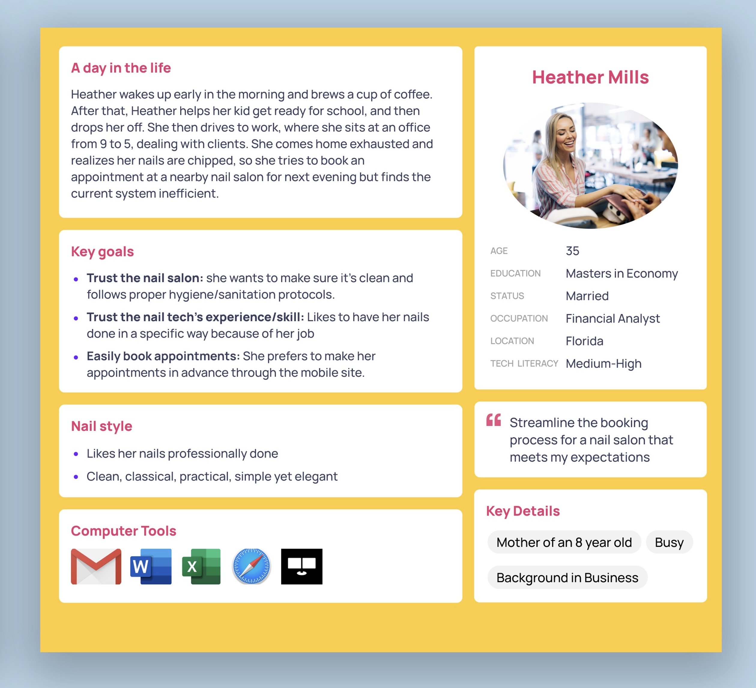
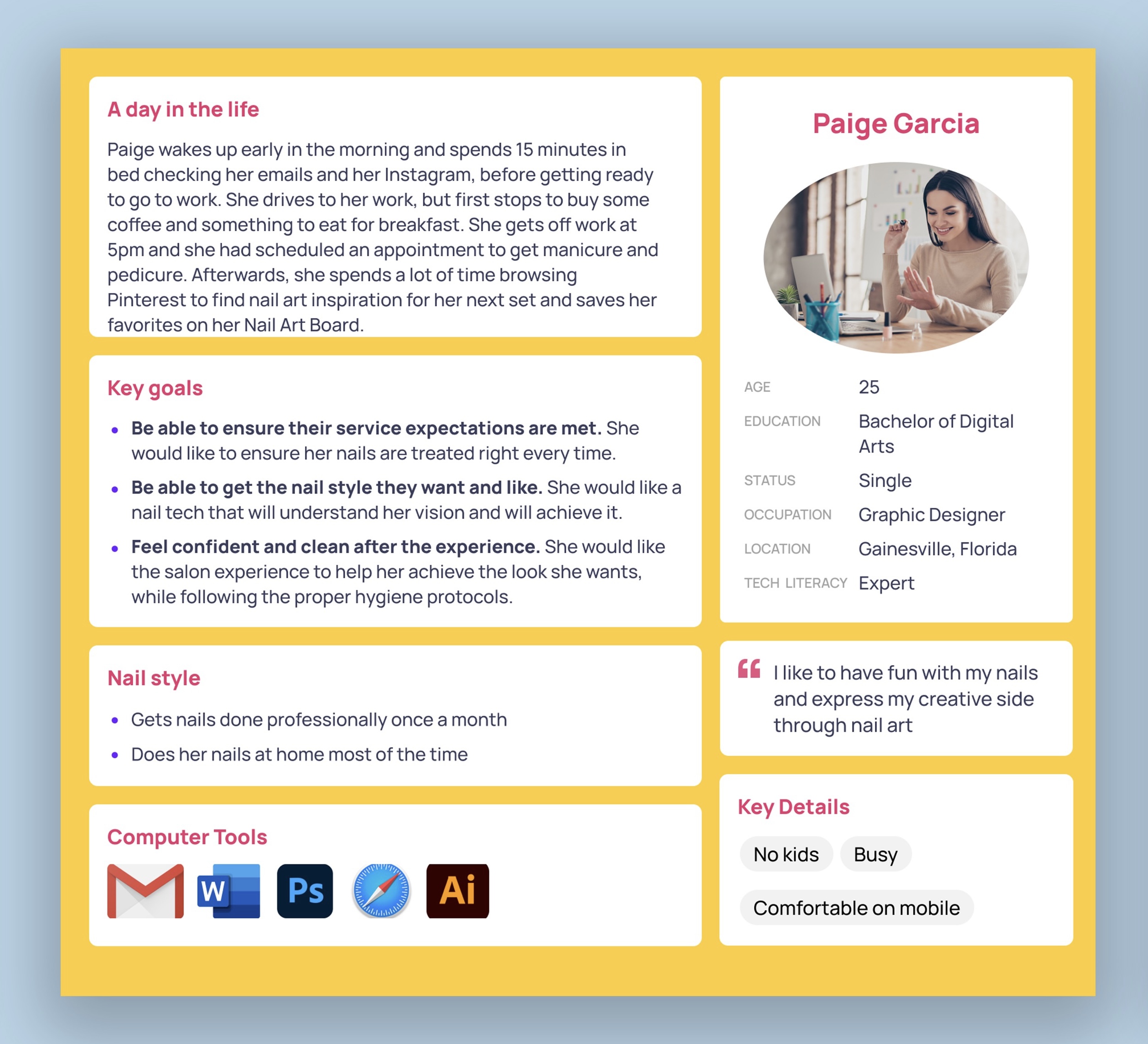
Personas
We came up with two personas that we felt represented the target users best. One with more of a conservative and efficient style, and another one with a creative and crazier style.
Design Concept
After brainstorming and voting based on the defined user and client needs, we identified the core features of our app design:
The home page is an Instagram-style grid of nail art. Some of the nail art will feature nails of previous clients.
The user can book specific designs by clicking on pictures on the home page. Pictures offer filter options.
Users can link Pinterest/Instagram posts during the booking process, add comments and specify the location.
There will be a booking page that lists services and how long they take, as well as starting price.
There will be a nail quiz which will offer options for special occasions, ask lifestyle question, suggest color schemes and designs, be 5-10 questions, and have multiple choice questions with images.
There will be a page with reviews/testimonials of previous clients.
There will be a FAQ page which mentions hygiene/sanitation protocols.
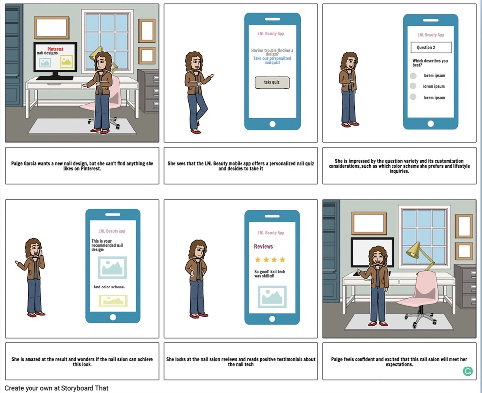
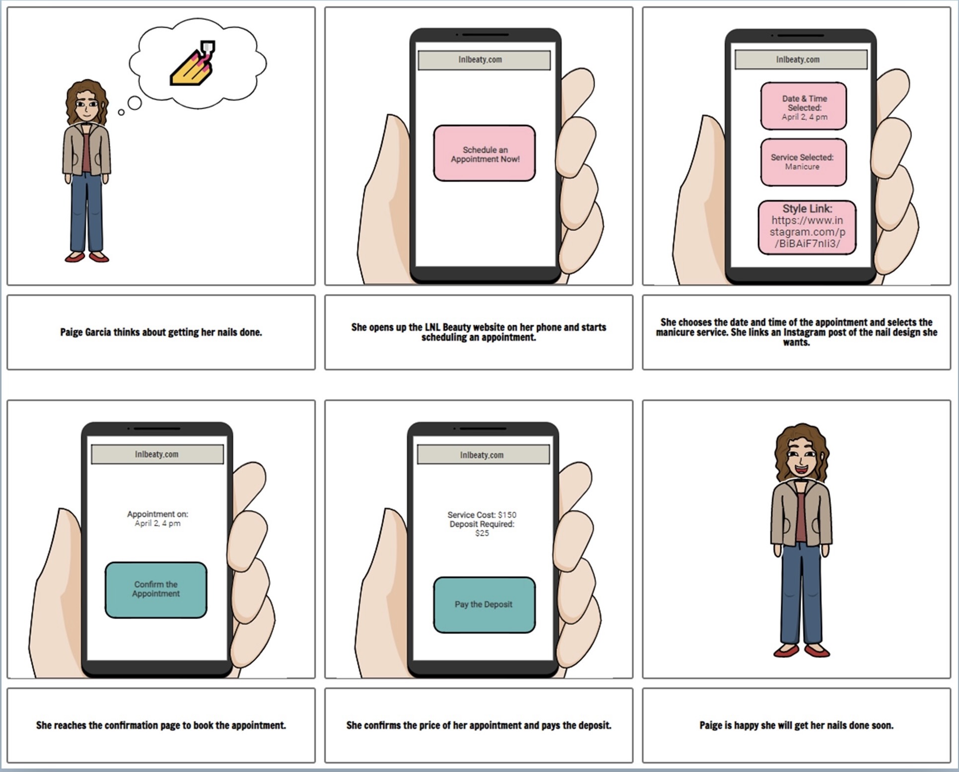
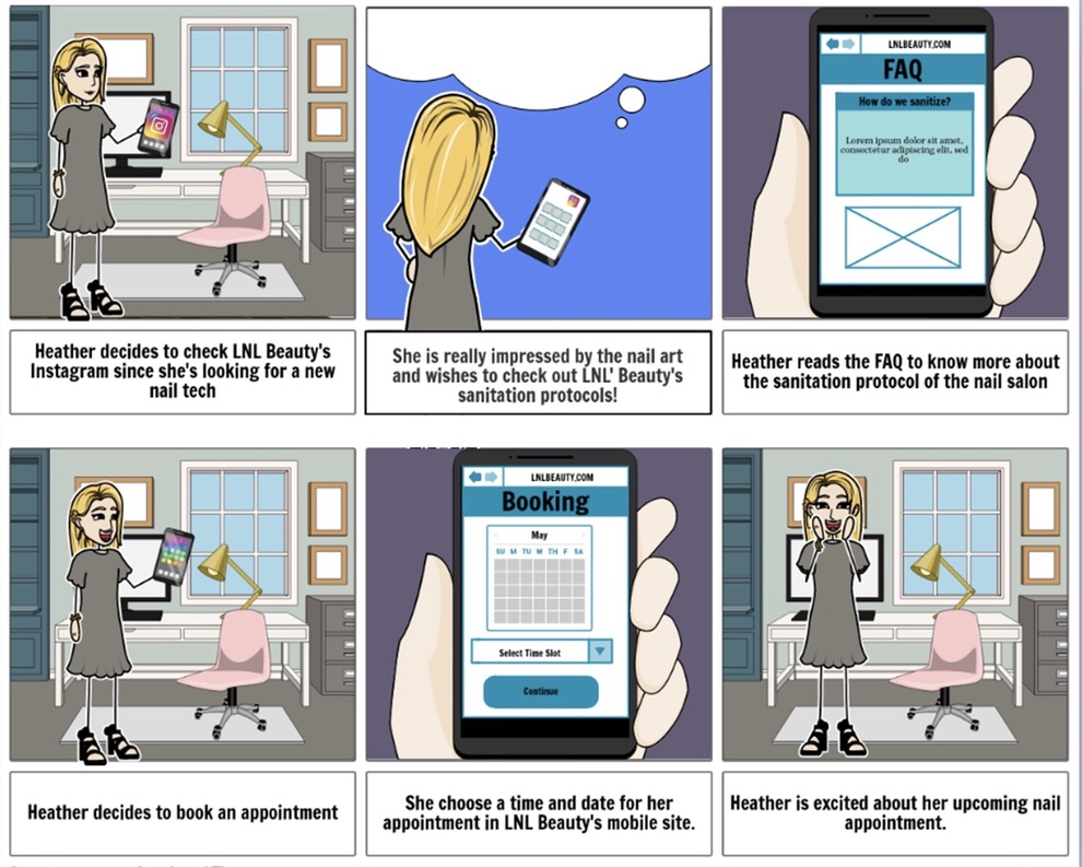
Scenarios/Storyboards
Our scenarios were based off of the created personas and were put in situations in which they would use the features in the LNL Beauty app.
Task Flow
We made a user task flow that shows the flow of the application and the potential ways they can navigate it.
.jpg)
Design
After defining the features that it needed to include we started sketching up some low-fidelity wireframes which we printed out to do a paper prototype user test to test three different alternatives of the booking appointment process.
Flow Diagram
After some user testing and feedback, some aspects of the design were altered and this was the revised flow diagram:
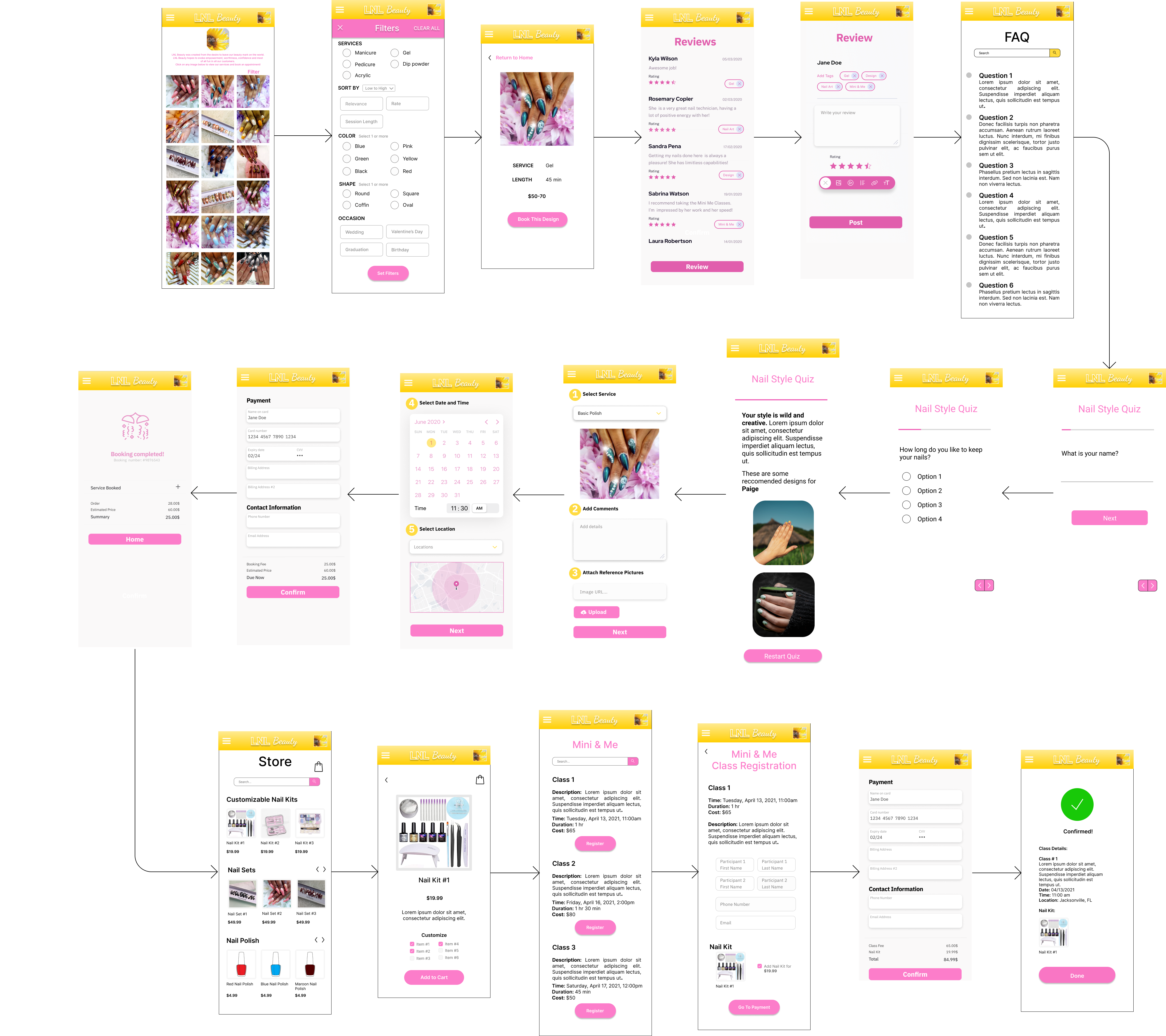
Final Result
After revising and testing once more we got good feedback and we made our final interactive prototype in InVision, and created a video sketch.
P.S. After revising the project I realized the UI needed improvement and could look better so I went ahead and redesigned the UI of the app and made another prototype in Figma.
.png)